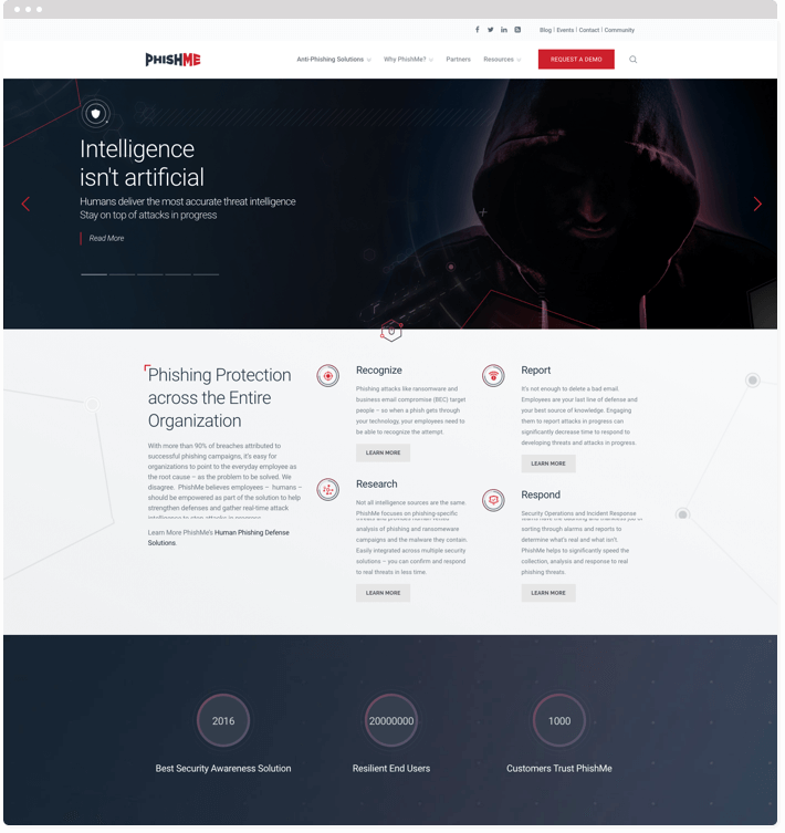
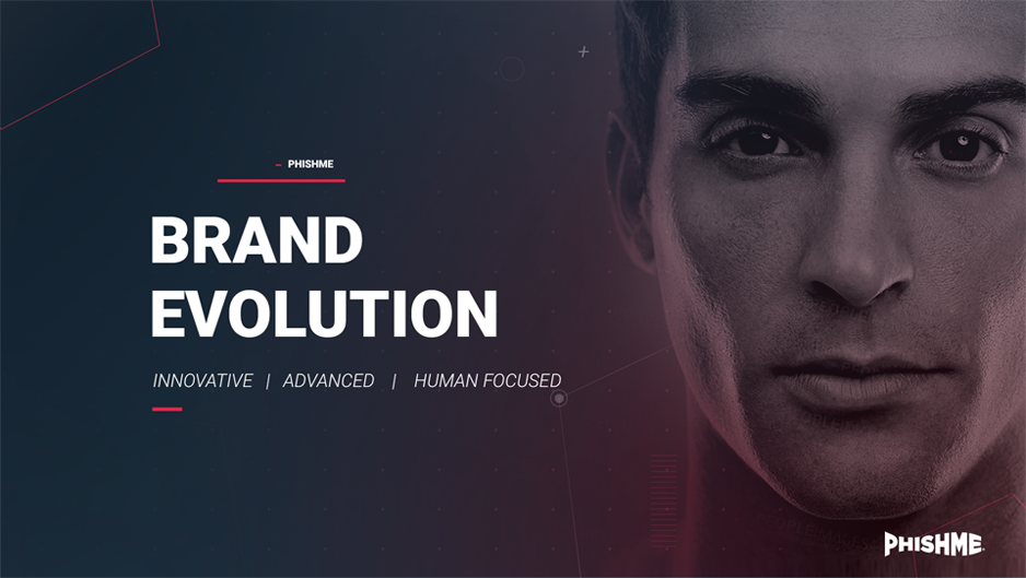
Reshaping the PhishMe brand and digital experience to enhance their belief in human-based phishing security.
PhishMe is a US-based company that believes employees – humans – should be empowered as part of the solution to help strengthen security defenses and gather real-time attack intelligence to stop attacks in progress. They focus on phishing-specific threats and provide human-vetted analysis of phishing and ransomeware campaigns.
Following a successful rebranding and website redesign project, drafteq continues to provide ongoing design support to PhishMe across several different mediums.
We engaged with key members of the PhishMe team through extensive workshops, surveys and collaborative moodboards to ensure we arrived at a brand that truly represents PhishMe.
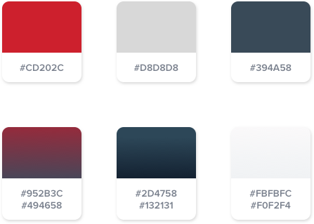
We expanded out the existing PhishMe colour palette by adding gradients to provide more depth and keeping the original colours as accents.
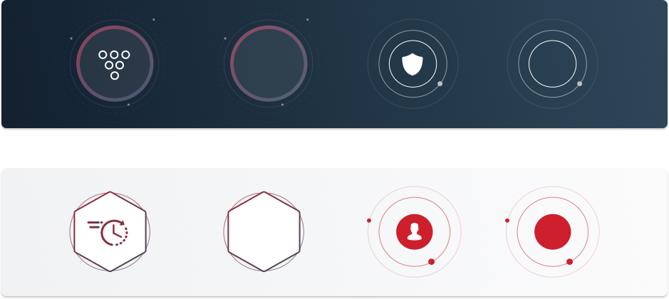
We created a library of sci-fi inspired brand elements which we could easily use and adapt for print and digital deliverables, allowing for speedy future implementations.
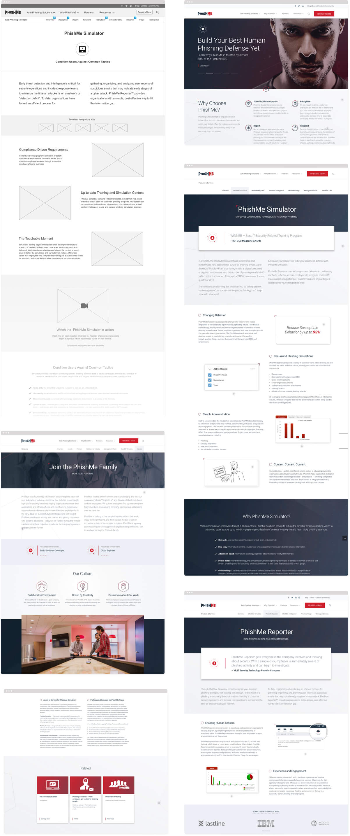
Detailed wireframes helped us focus on the most important features and flows of the marketing site. By showcasing PhishMe products upfront, the marketing site was better positioned to increase sales and lead generation.
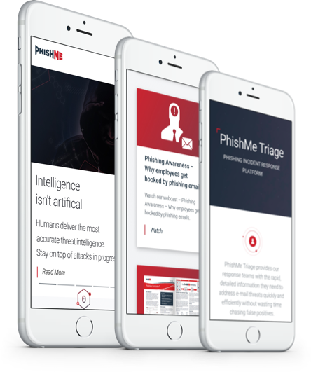
We worked closely with our development partner to ensure that all designs looked and functioned as great responsively on mobile and tablet devices, making tweaks to the layout and design where necessary.
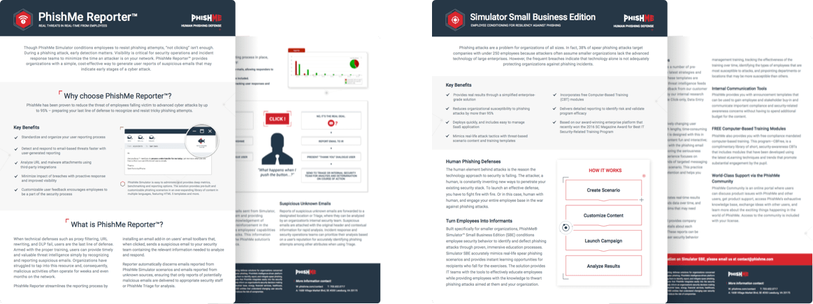
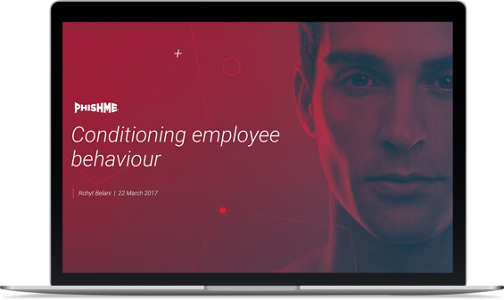
We support the PhishMe marketing team with ongoing design support on a range of deliverables from newsletters, case studies and presentations, to large-scale conference booth designs.
The PhishMe team delivers sales and technical presentations on a regular basis. We’ve created templates and custom diagrams to make sure that their presentations are of a high-quality and stay on-brand.