Building and branding a mobile platform that introduces a streamlined, hassle-free school payment experience for parents
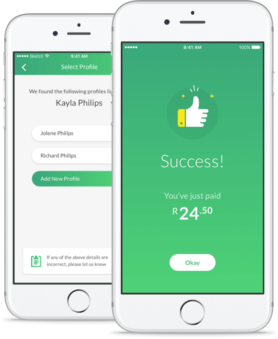
Karri is a mobile app that allows parents to make quick, efficient payments to their childrens’ schools. Instead of sending children to school with envelopes of notes and coins for civvies and class outings, parents are able to make direct payments of exact amounts.
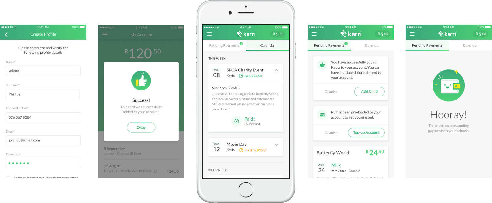
The app offers several features that make the management of school payments easier, including a calendar that helps parents keep track of upcoming or unpaid school activities, and the ability to pay for multiple children attending different schools.
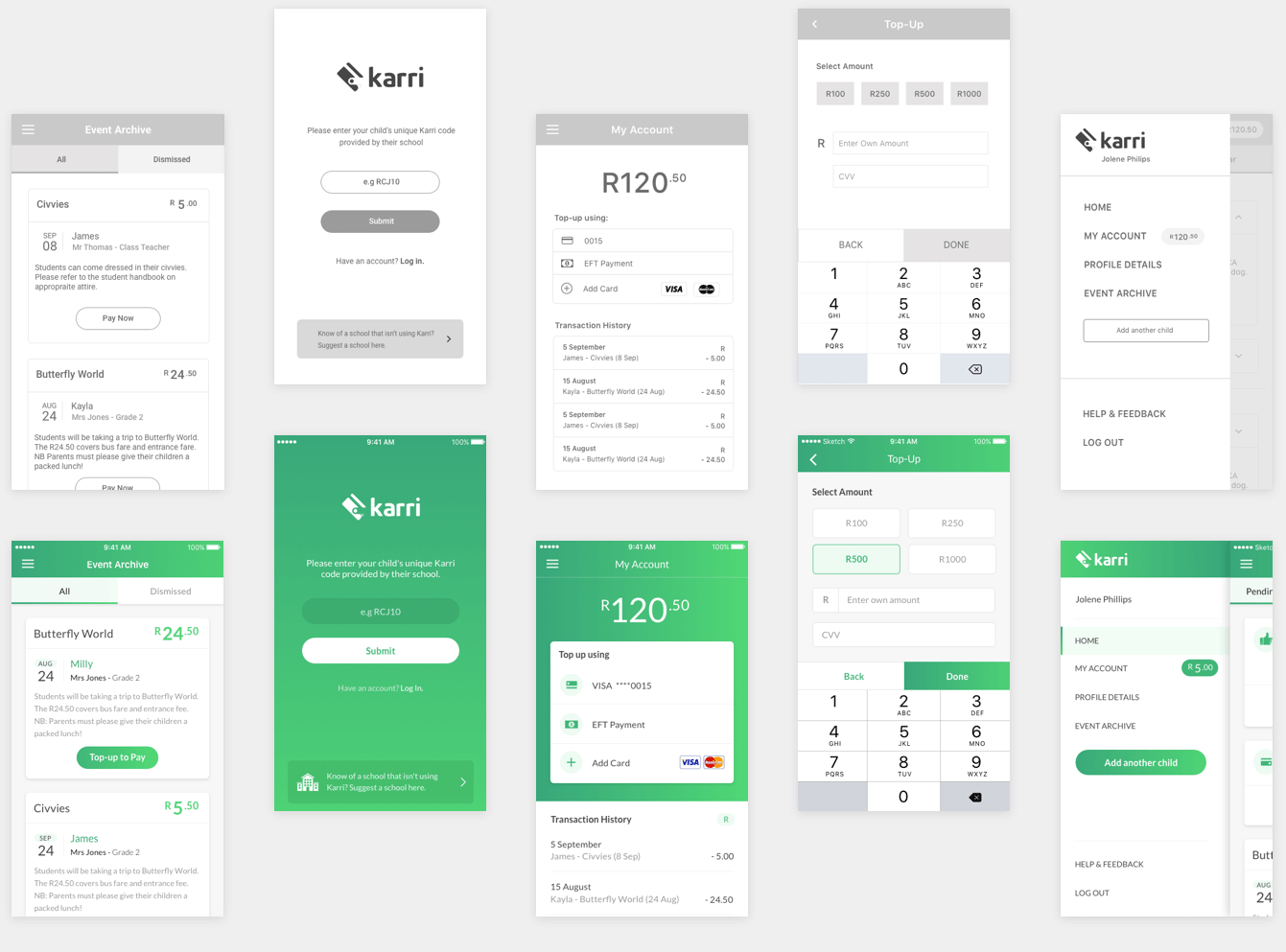
A set of collaborative workshops with the Karri team enabled us to flesh out some onboarding complexities, investigate multiple user scenarios and experiment with various branding options. We built a fully interactive prototype before taking the app screens into design.
We chose a set of vibrant, contemporary greens, inspired by Karri’s goal to modernise and enhance a traditional payment method.
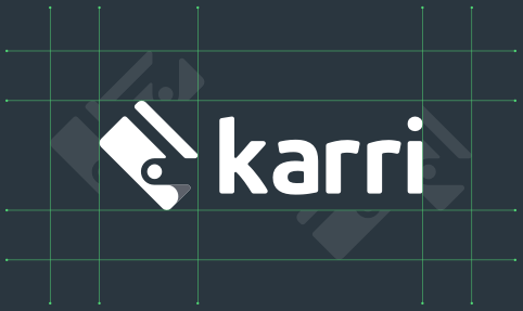
After several iterations, we decided on a logo typeface that felt in line with the ideals of simplicity, modernity and approachability that we had in mind when crafting the app’s branding.
The logo mark, a stylised credit card, references the idea of fast, effortless payment, and was extended out into the app icon.
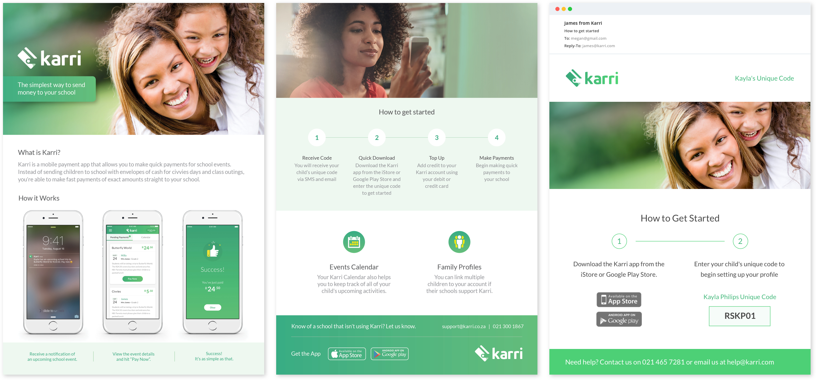
Gaining support from parents who had become used to paper-based school payments was understandably a challenge. It was important for parents to be made aware of their school’s endorsement of the app, and to ensure that getting onto the app was an easy, seemless process. We helped plan out an onboarding process that involved a school endorsement letter, printed marketing pamphlets, sms and push notifications and emailers, and designed all the collateral for the process.