Shaping Clip Karma’s brand identity and fleshing out a clean, approachable design direction across multiple applications.
Sonic Foundry, based in Wisconsin, USA is an established contender in the realm of video sharing and collaboration. The vision for Clip Karma came from the desire to add to their existing, successful product suite. Clip Karma enables users to share, upload and embed videos inside private communities.
We were approached to assist with multiple sections of the project. These included general UX consulting, UI design, logo design, front-end development and QA. The client had a clear vision of the business need, personality and positioning of the product. We helped craft a product that is simple to use with complex features like video encoding and analytics working seamlessly in the background. Clip Karma was launched in 2015 and is currently in beta.
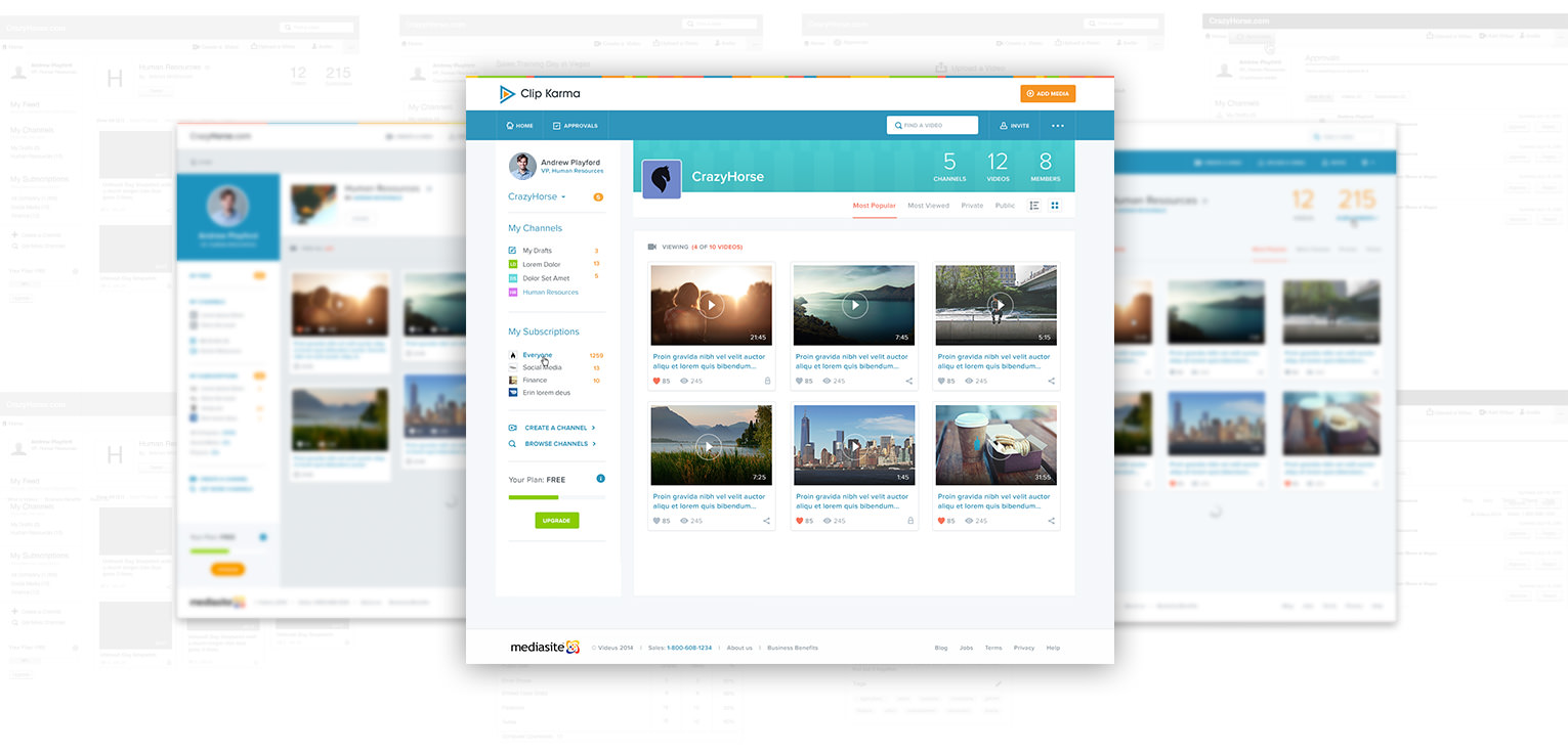
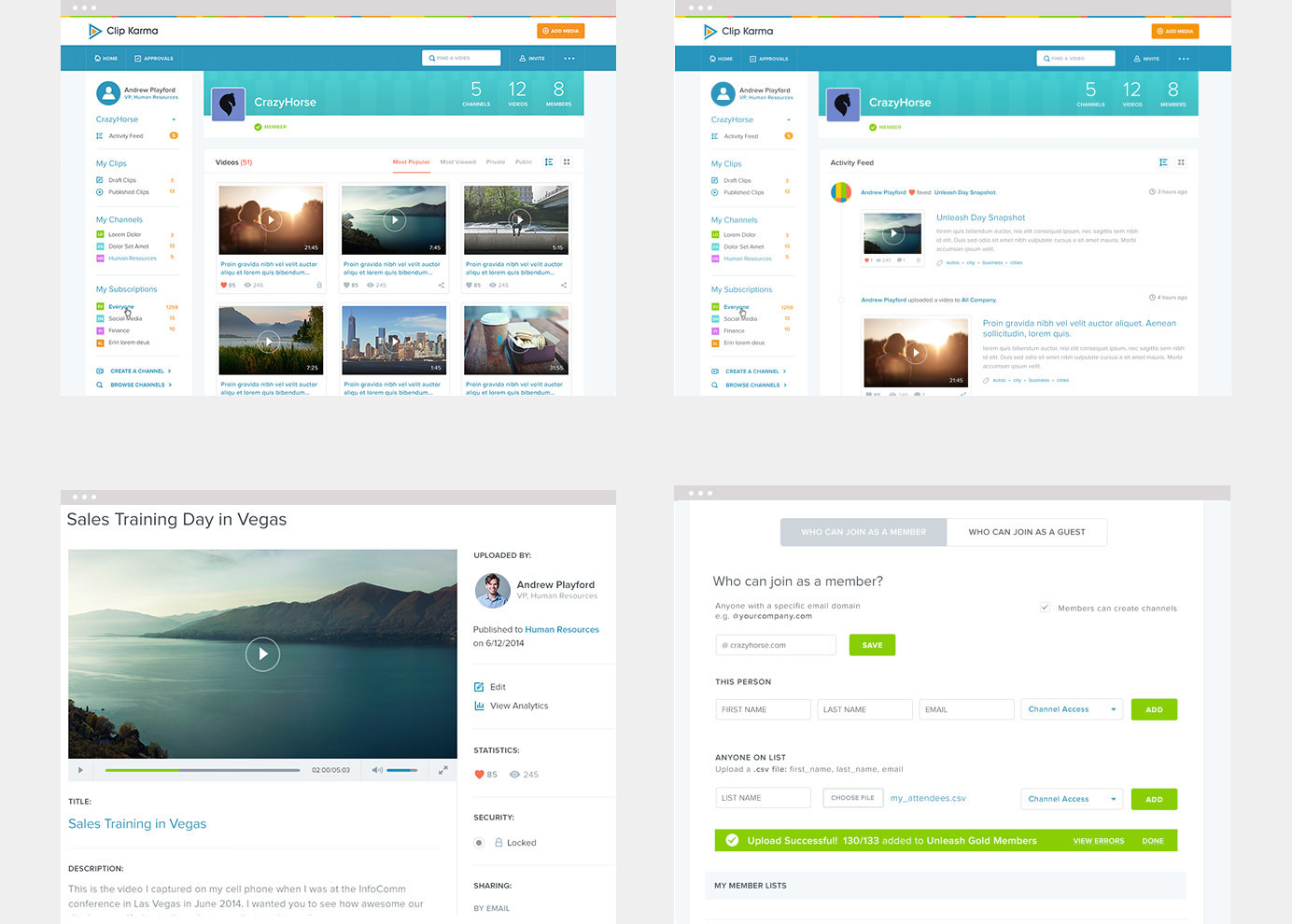
We were inspired by existing video platforms, yet still went through multiple iterations of the layout to end up with the best structure for Clip Karma. With four different navigational structures, we worked hard to overcome the responsive challenges that we faced. Our designs continued to evolve, even after the platform went live.
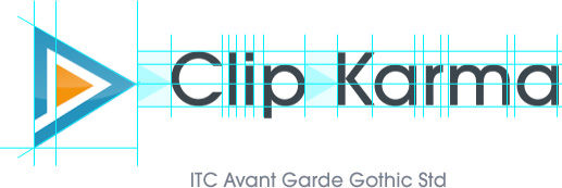
We had fun crafting this crisp, modern logo that embodies the heart of Clip Karma - the video play button. The clean typography along with the angular lines of the icon reflects the simplicity and ease of use of the platform. Several iterations of the name and logo took place before agreeing on this version.
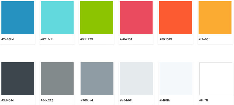
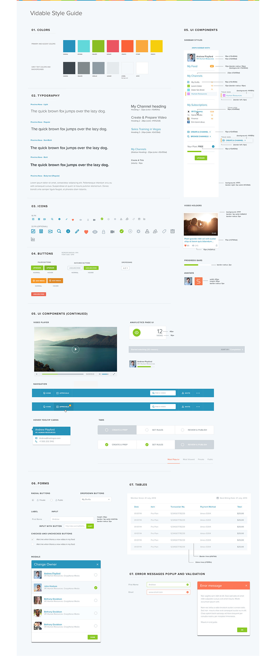
Sonic Foundry took inspiration from the colour bar patterns that displayed on many early television screens to form the basis of their colour pallete. We took these colours and applied them in a bright, modern way to build out Clip Karma’s colour pallete. These colour bars also formed the base of a pattern that we applied in the rest of the design.
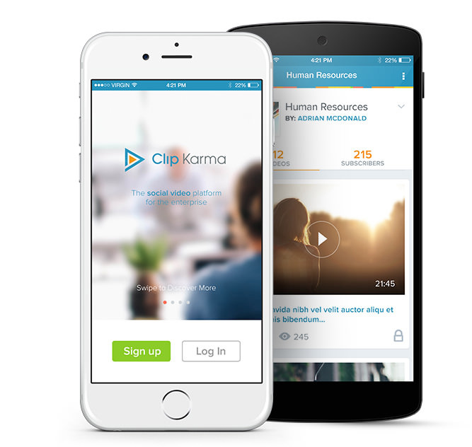
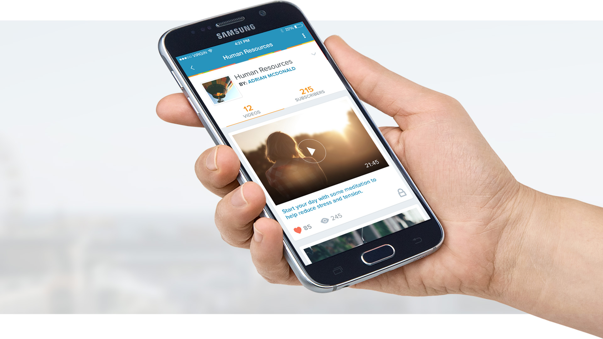
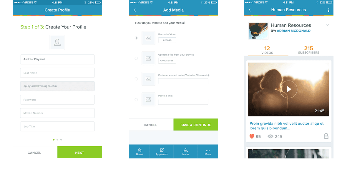
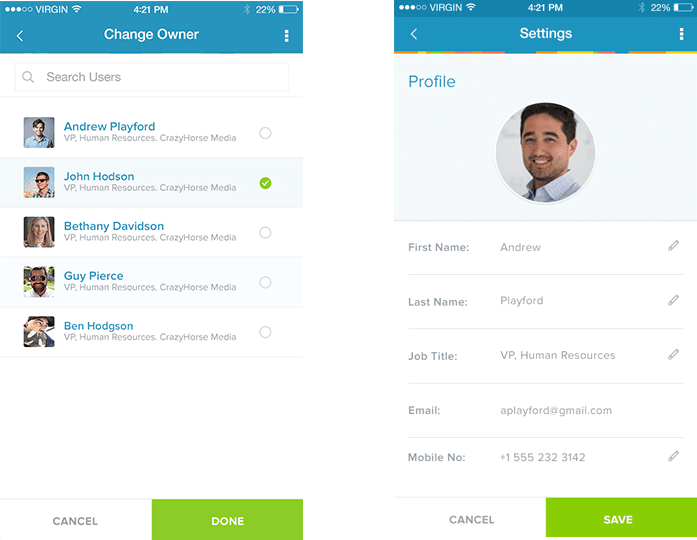
The mobile app was built as an HTML5 hybrid app and based on the original website content and design. We optimised the design for mobile devices with more of a native feel applied to both Android and iOS.
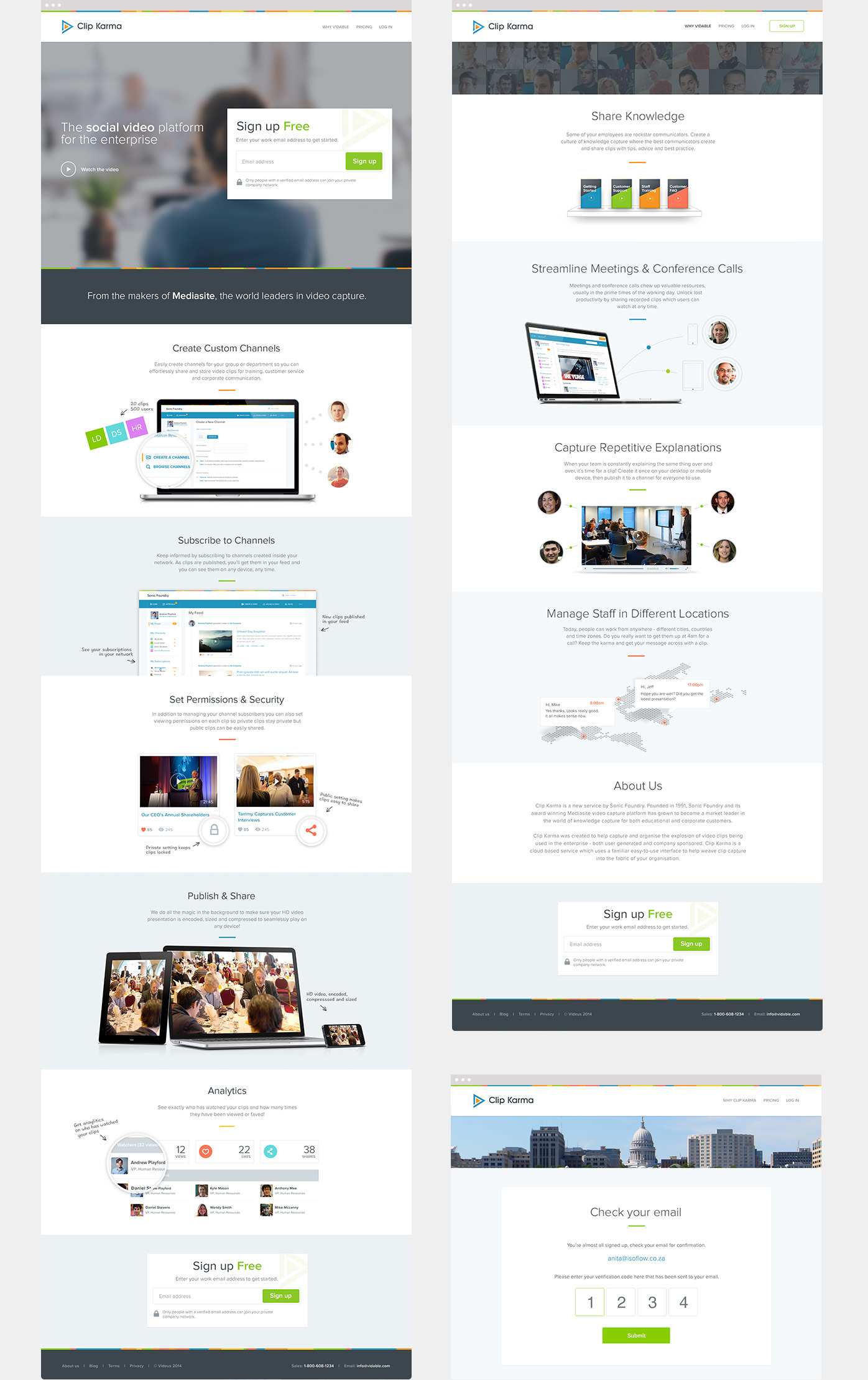
The marketing site entices users to sign up by explaining how Clip Karma works in a few easy steps. The descriptions were supplemented with handwritten-styled notes placed alongside the graphics for a more personal, notebook look and feel.
The web app allows users to upload new videos, create channels for specific content, subscribe and comment within their video community.
"Drafteq is really a great partner for any software development house. They do all the strategic planning, provide creative solutions and designs, allowing us to stick to what we do best - just coding it. We happily endorse their services!"
We compiled a comprehensive style guide of all the UI components to assist external developers in applying a consistent design. We elaborated in detail on font sizes, colour usage and icons to make sure our design was followed through on all implementations. Overall this helped improve communication between the developers and designers.
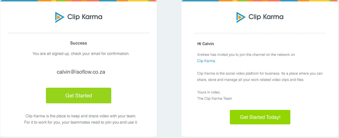
We made use of Clip Karma's vibrant branding on these email templates, but at the same time made sure the users attention was drawn to the email content and the call-to-action buttons.