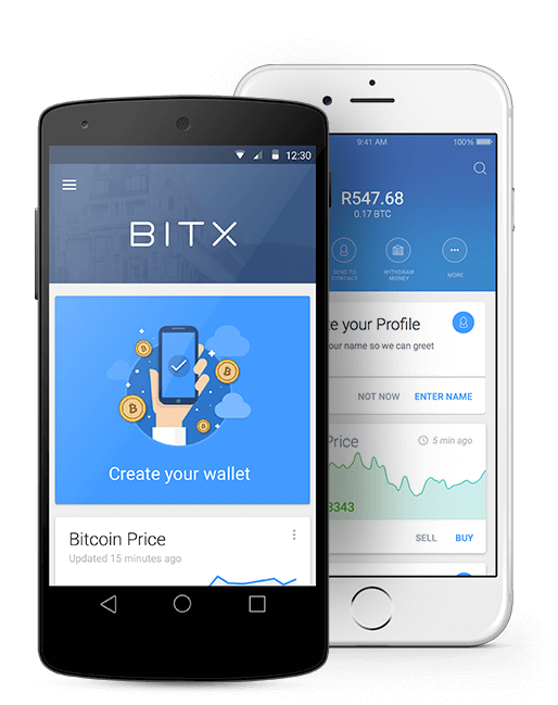
BitX is a global Bitcoin platform, providing highly secure wallets, institutional quality exchanges, and various API’s for merchant and other business integration. BitX customers can use the BitX Smart Wallet for faster and cheaper money transfers to family and friends, buying things online and trading and storing their Bitcoin. BitX has always been a mobile first company, building their business around a mobile core. This is in line with their company vision to make money frictionless and universally accessible.
Drafteq has been consulted on various stages of the BitX journey, predominantly around user experience and design collaboration.
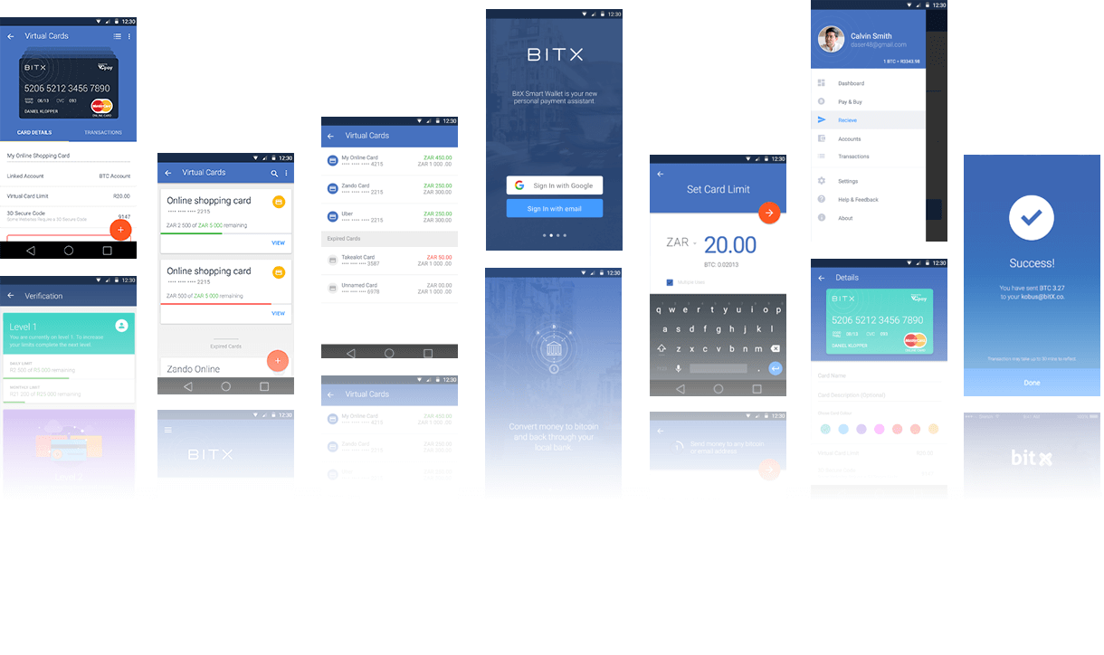
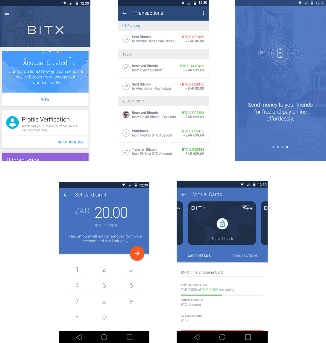
We kicked off the project with workshops alongside the BitX team, which initiated a collaborative working environment. While our involvement began with minor UI & UX improvements to the current app, we were later given the task of redesigning the app with a fresh look aligned with Google’s Material Design Guidelines.
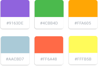
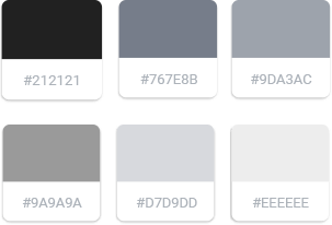
We took BitX’s existing colour palette and gave it a fresh, modern feel by steering the colours away from a previously gradient-based UI and incorporating brighter tints that were more appealing and inline with material design.
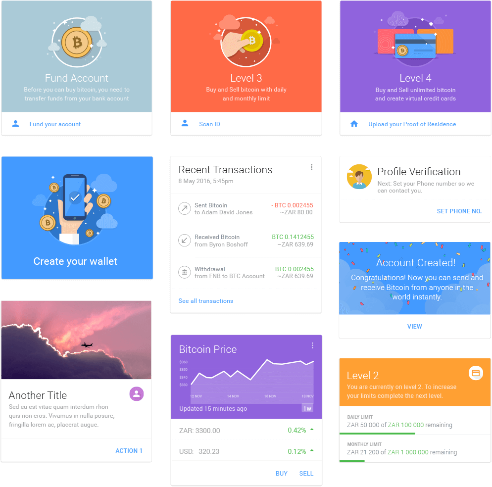
The overall redesign of BitX’s current app involved re-thinking the entire user experience, as well as introducing new concepts and features to increase the app’s efficieny. A significant part of the redesign was the adoption of material design’s card-based system for displaying content.
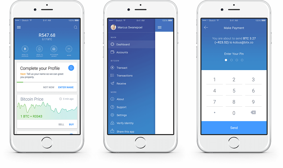
While the majority of BitX users have Android devices, the app is also available for download on iOS. We applied the same material design approach to the iOS app but incorporated the relevant styling such as gradients for more of a native app feel.
The detailed card designs were an important part of our redesign. We took a close look into the application of cards in material design and made use of fun illustrations, bright colours and crafted typography to display the data.
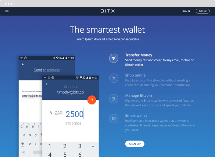
The mobile design was adapted to create a web version, with an emphasis on good user experience and responsiveness. Our biggest challenge was the navigation; we explored different options and mutiple iterations were required.
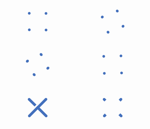
We designed a custom universal loading animation, formed around the BitX logo. We utilised the playful nature of the rotating X.
BitX asked for our help with redesigning a section of their marketing website. We improved the layout, the UX and added with some fresh new graphics.